12 Things to Fix That Are Quietly Costing You Donations
By Herb Locke, Founder of BarkLogue
How to Use This Checklist
Go through your shelter website right now with this list open.
Check each item honestly. If something is not in place, mark it and fix it before moving to the next one. All 12 items are fixable without a developer or a budget. Most take under 30 minutes each.
Section 1: The Donate Button
1. Is your donate button visible without scrolling on the homepage?
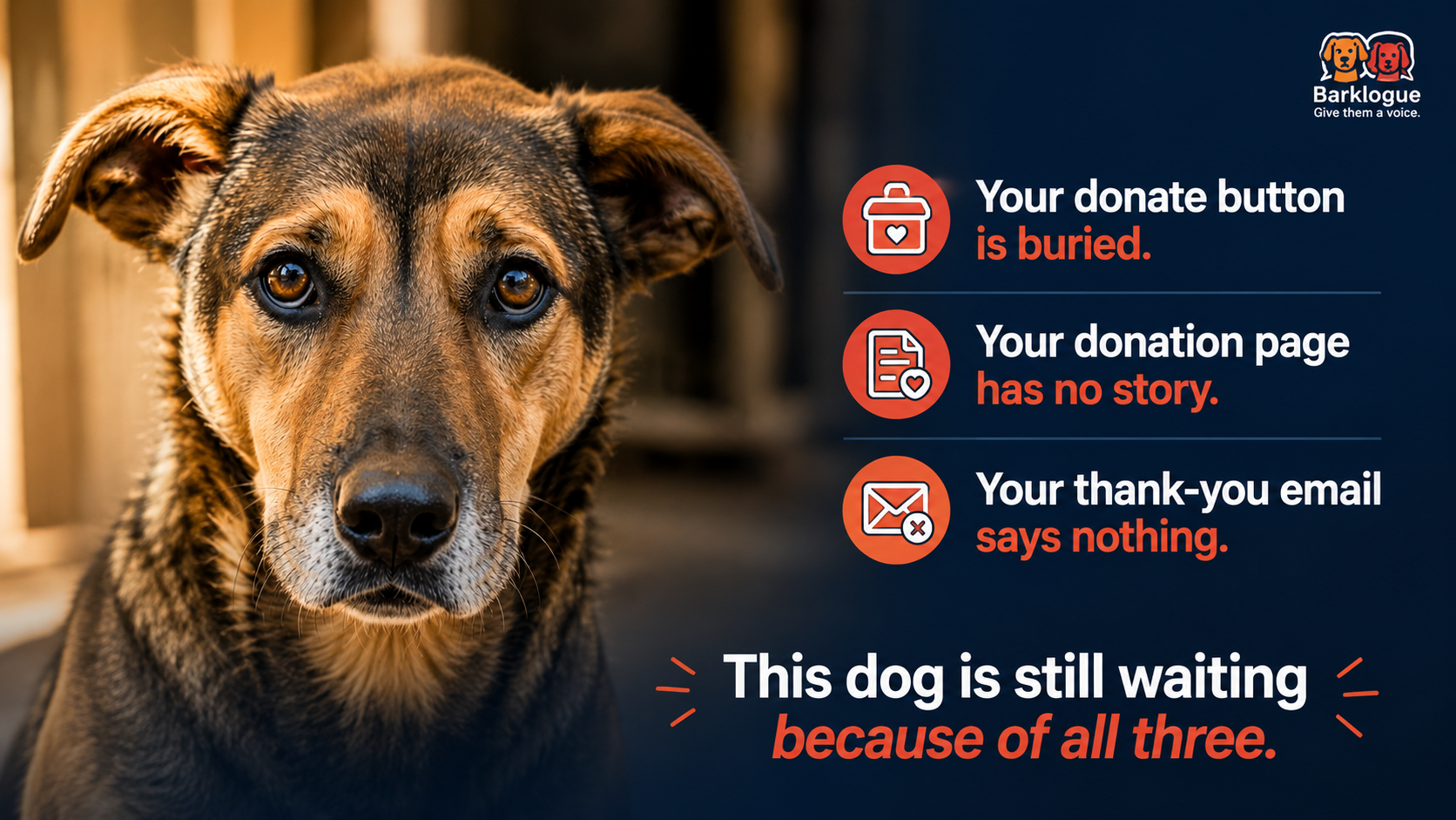
A donor who feels something in the first 10 seconds of visiting your site will not scroll to find a way to give. That feeling has a shelf life of about 30 seconds. If the button is not visible the moment the page loads, you are losing donations from people who genuinely wanted to give.
Fix: Move the donate button to the top right corner of your navigation bar. Make it a different color from everything else on the page so it stands out immediately.
2. Does the donate button appear on every page of your site?
Donors do not always enter through your homepage. They land on an animal profile, a blog post, or an about page and feel something there. If the donate button is only on the homepage, you are invisible to them at the moment they are most ready to give.
Fix: Add the donate button to the navigation bar sitewide, not just the homepage.
3. Does your donate button use active language?
Donate Now converts better than Donate. Give Today converts better than both. The language signals immediacy and makes the action feel available right now rather than optional later.
Fix: Change the button text to Donate Now or Give Today.
Section 2: The Donation Page
4. Does your donation page have an animal on it?
Most shelter donation pages have a form and nothing else. The donor clicks the donate button in a moment of emotional connection and lands on a blank transaction page with no animal, no story, and no reason to feel anything.
That drop kills conversions.
Fix: Add one animal to the donation page. A photo, a name, and two sentences about who they are. Change this animal monthly so returning donors see someone new each time.
5. Does the donation page explain what each giving amount does?
Donors want to know that their specific contribution means something specific. A vague ask for any amount feels less compelling than a concrete explanation of what that amount provides.
Fix: Add a simple breakdown. For example: $25 feeds one animal for a week. $50 covers a vet visit. $100 sponsors an animal’s full care for a month. Use your actual costs. Donors appreciate honesty.
6. Is there a monthly giving option clearly presented?
Most donation pages have a monthly giving option buried in the form as a small checkbox. Donors who would have chosen monthly giving miss it entirely.
Fix: Make the monthly option a prominent choice at the top of the form, equal in visual weight to the one-time option. Add one sentence explaining why monthly gifts matter: monthly donors allow us to plan ahead and care for animals consistently rather than relying on campaign cycles.
7. Is the donation form as short as possible?
Every additional field on a donation form reduces completion rates. Name, email, and payment information are all you need. Everything else is friction.
Fix: Remove any optional fields that are not essential to processing the donation or issuing the tax receipt. Ask for additional information in the follow-up email instead.
8. Does your donation page load quickly on a phone?
More than half of charitable donations are now initiated on mobile devices. A page that loads slowly or displays poorly on a phone loses those donors before they complete the transaction.
Fix: Open your donation page on your own phone right now. If anything looks broken, overlaps, or takes more than three seconds to load, flag it for your web person as an urgent fix.
Section 3: The Confirmation Email
9. Does your confirmation email name a specific animal?
The automated receipt most shelters send says: thank you for your donation of $X. Your support helps animals in need. Tax ID included.
That is the last impression you leave on someone who just chose to give you their money.
Fix: Add two sentences to your confirmation email that name a specific animal and one detail about them. Update this monthly alongside the animal on your donation page. This single change is the most underused improvement in shelter fundraising.
10. Does your confirmation email tell the donor what happens next?
A donor who gives and then hears nothing has no thread to follow. They complete the transaction and the relationship ends there unless you give them a reason to stay.
Fix: Add one line at the bottom of the confirmation email: we will send you an update on this animal in the next few weeks. That promise creates an expectation and a reason to open the next email you send.
11. Does your confirmation email have a reply-to address that someone actually monitors?
Many automated confirmation emails are sent from a no-reply address. A donor who wants to respond, ask a question, or share the email with a friend has no way to engage.
Fix: Change the reply-to address on your confirmation email to one that a real person monitors. Even if responses are occasional, the option signals that there is a human behind the organization.
Section 4: The Overall Experience
12. Does your website tell visitors what to do first?
Most shelter websites have too many options competing for attention at once. Adopt. Donate. Volunteer. Foster. Sponsor. The visitor looks at all of them and chooses none.
Fix: Decide on the single most important action you want a first-time visitor to take and make that action more prominent than everything else on the homepage. Everything else can live in the navigation. The primary action should be impossible to miss.
The 20-Minute Audit
Set a timer for 20 minutes.
Open your website on your phone, not your desktop. Visitors see the mobile version first and most often.
Go through each of the 12 items above and mark yes or no.
For every no, write one sentence describing what needs to change.
Then fix the easiest three first. Momentum matters more than perfection.
Created by BarkLogue. Helping shelters build websites that turn visitors into donors. barklogue.com